McAfee Onboarding
The situation
As a company, McAfee works with a number of manufacturing partners to provide online security products for desktop on a 30 day trial with the option to purchase. These OEM (original equipment manufacturers) customers entered the McAfee desktop experience with little familiarity and high uncertainty. There was no onboarding to guide them, no context, no direction, and no clear signal that the product was doing its job.
How I helped drive a value-led experience
The shift from no onboarding to my approach of visible activation changed behaviour in measurable ways. Instead of treating onboarding like a checklist, we made each step feel like turning on protection. We made it easy to see that the product was working on the main screen. And we created a system that remembers where you left off, and guides you through what's next. This approach helped people feel more confident about their protection, one step at a time.
The impact proved the strategy: 43% more people used our main features, 17% more people registered accounts, and we saw a 6.8% increase in purchases. We later rolled out this approach to paying customers in 8 geos, and to our web app, making it the standard for how we welcome all new users.


Identifying an opportunity
Early sentiment data showed that confidence, convenience, and satisfaction dropped almost immediately after first use.
We lose people's trust quickly when we:
01
Ask them to relinquish their privacy before establishing a relationship of trust
02
Tell them they're safe with no clear evidence and expect them to just take our word for it
The absence of onboarding was both a usability gap, and a missed opportunity to build trust during the most critical window of the relationship: within the first week.
From the research it was clear that trust must be established before we ask for anything, and users need observable proof that protection is working.
Our opportunity was to design an onboarding experience that:
01
Established trust early
02
Made protection visible and understandable
03
Guided users toward meaningful actions
04
Balanced immediate user expectations with long-term product strategy

Defining constraints and requirements
OEM context
Users arrive with limited time, attention, and product familiarity.
Business & product goals
Reposition McAfee as more than antivirus by emphasizing personal info and identity protection
Ensure a path to purchase right from the welcome screen
Increase identity and personal info feature enrollment and expand feature usage.
Improve conversion and adoption
Design a section on the dashboard to communicate marketing messaging
Onboarding needed to scale beyond trial users and across geos
User reality
Most trial users arrived specifically for antivirus (AV) and device security
Users didn't want to be prompted to purchase without perceived value or full context
Legacy systems
Account creation and authentication flows required significant engineering effort
App container had a width limit and no scroll, only allowed for 4 cards at a time
The challenge was designing an experience that served both business goals and user needs without sacrificing trust.

Discovery
Before designing anything, we needed to understand how trust evolves over time. We conducted a 30-day diary study with 25 participants (most of whom were not existing McAfee users) to understand how sentiment evolved over time.
What we learned
01
Confidence drops fast, and early. By Day 6, we saw the sharpest drop in sentiment.
02
Convenience is critical. Users felt the product didn't fit easily into their lives—even when they believed it was effective.
03
Trust is eroded when asserted, not demonstrated. Being told "you're protected" wasn't enough. Users wanted to see why.
04
Threat awareness grows over time. As users understood risks better, they felt more confident that McAfee was protecting them.
05
Moments of truth weren't feature-specific. Positive sentiment came from observable proof, exceeded expectations, and clarity.
Designing around trust, not pressure
My goal for that crucial first week was to build credibility. To achieve this, I followed four key design principles that I defined in collaboration with the team:
01
Demonstrate value by simplifying complexity
Our users don't understand our products, and they shouldn't have to. They just need to know how we're protecting them at a high level.
02
Show users we have their back
We sell the feeling of safety. When users don't see evidence of protection, they assume we're not working. Communicate that we're protecting them without overwhelming them.
03
Notify smart
Use notifications for both actions and reassurance that we're working, without overdoing it.
Communicate urgency accurately without alarming users. Messages should feel supportive, helping users feel safer and in control.
04
Personalize and contextualize the experience
Use what we know about a user's usage pattern to personalize and contextualize the experience.
Defining the onboarding set up actions
The primary product goal was to increase feature enrollment (particularly for identity and personal info protection), and deliver value as quickly as possible. In choosing which features to include in the onboarding journey, we prioritized those that:
Required minimal personal information upfront (addressing user hesitation to share data before trust was established)
Included identity protection alongside privacy and device protection (meeting both business and user goals)
Could provide immediate feedback and value
We selected three features:
VPN (privacy and device-focused, requires no setup, provides immediate feedback), Identity Monitoring (a quick dark web scan requiring minimal setup that shows observable proof of protection), and Personal Data Cleanup (a comprehensive scan of your personal information across the internet to identify data brokers selling it, requires more information upfront).
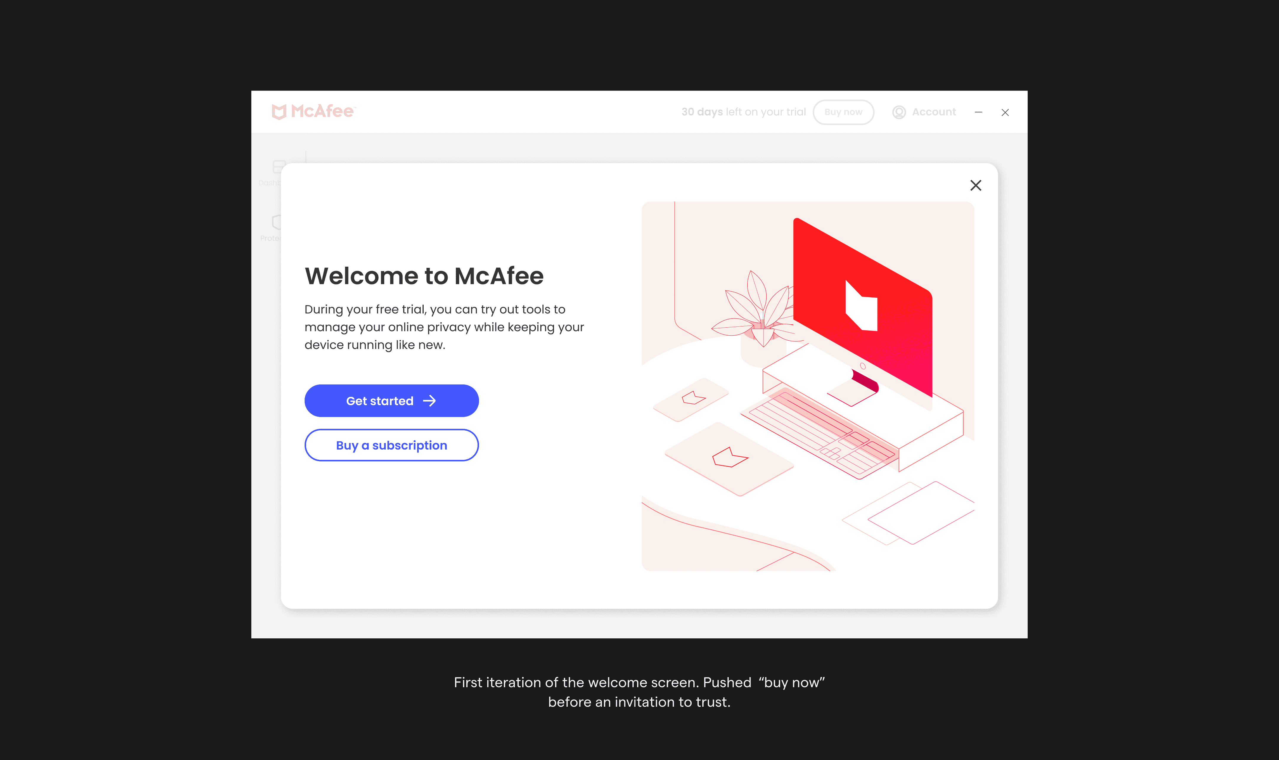
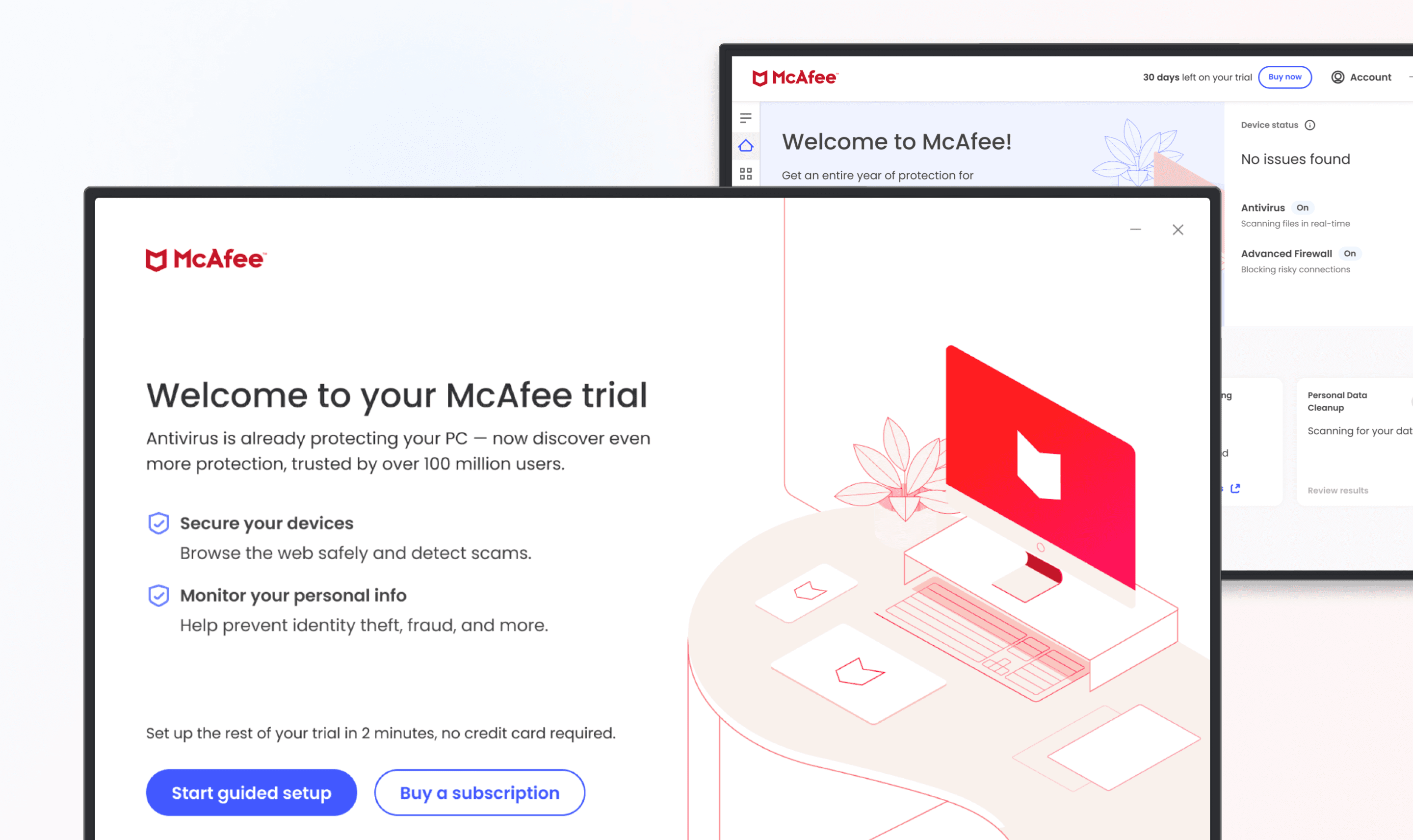
A clearer welcome screen
The initial welcome screen I designed lacked clarity. We were more focused on the amount of content that we sacrificed clarity for conciseness. Users didn't understand what the trial included, what the product actually did, or what to expect next. And, we pushed a "Buy now" CTA too early.
So, I revised the welcome to better orient users, highlighting core benefits and giving them enough info to feel confident before we asked them to commit to anything.
The "Buy now" CTA, though it tested as a point of friction with some participants, was a business requirement. I hesitated to include it initially, but it led to 18% of users converting. This was one of those moments where a little friction actually proves valuable.

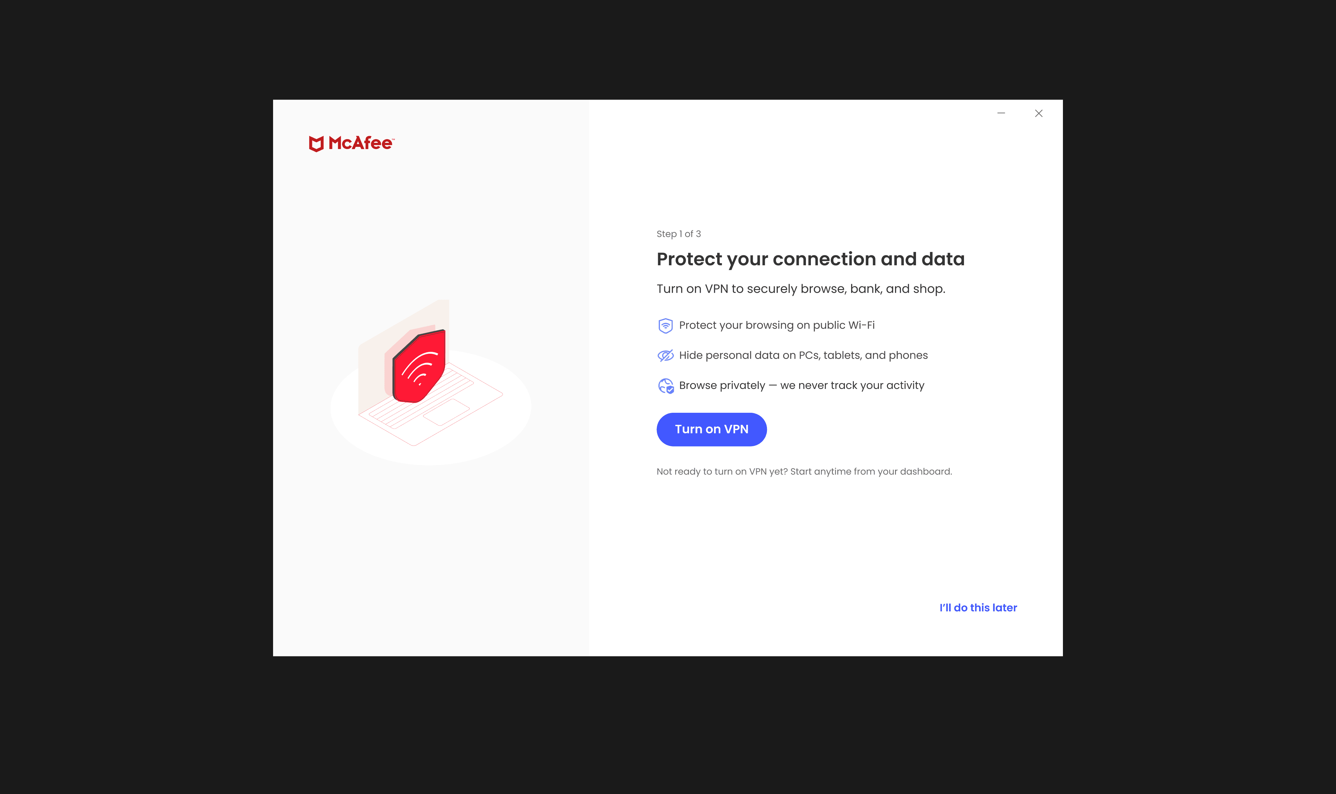
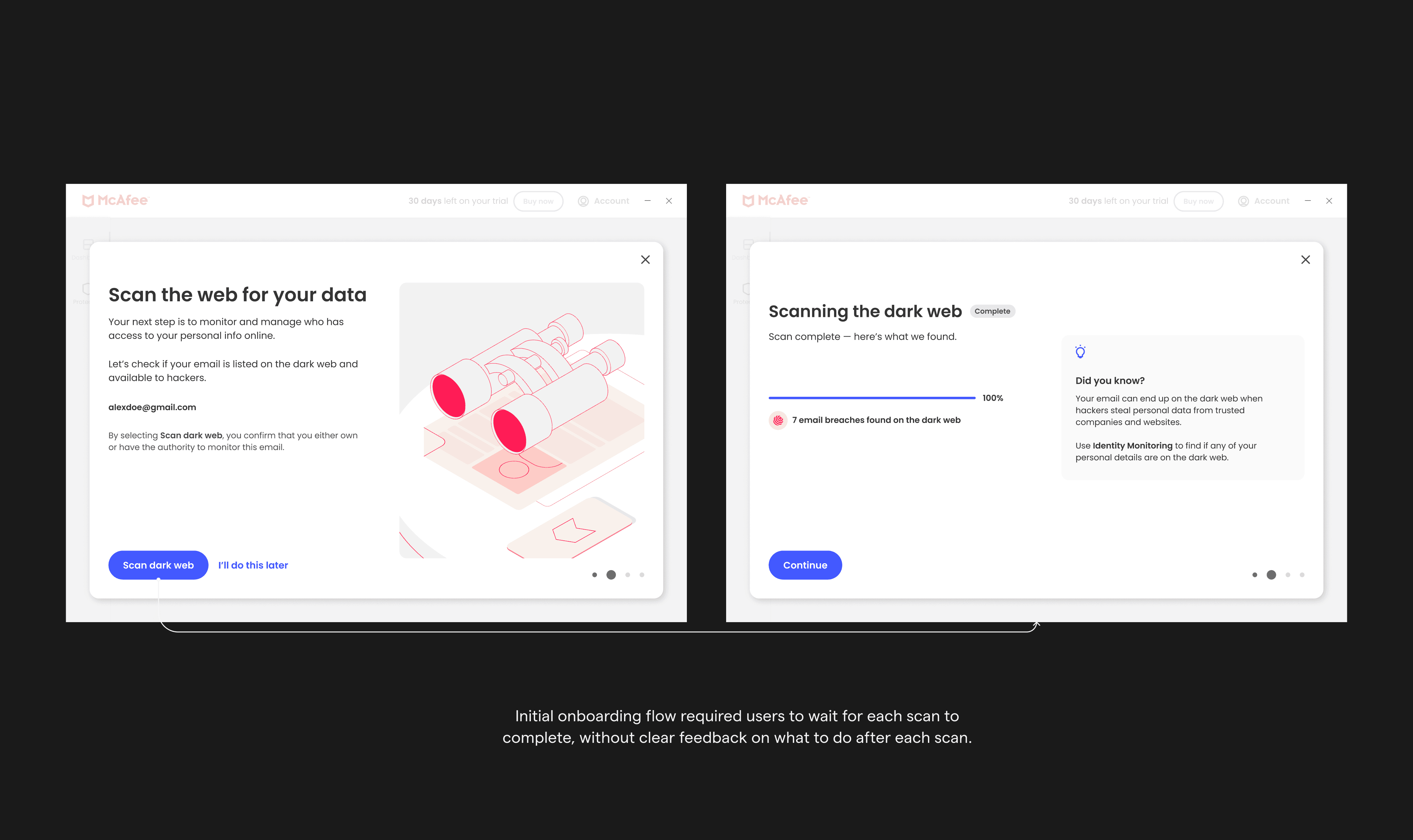
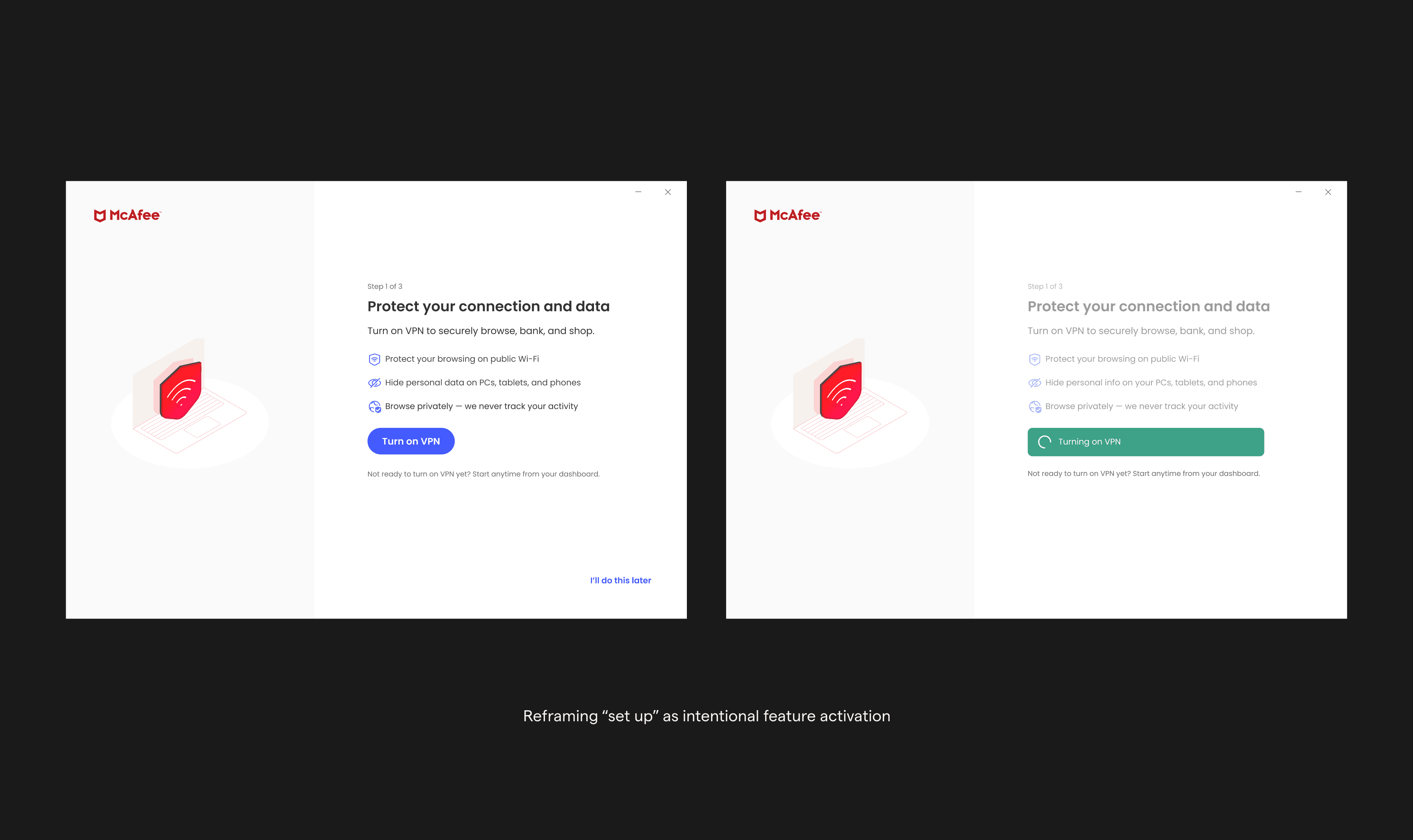
From “waiting for scans” to “turning protection on”
My initial defined onboarding flow positioned each onboarding action as a “set up” action. This approach required users to wait for each scan to complete, without clear feedback on what to do after each scan. This created dead time and uncertainty.
With feature enrollment as the primary goal, I reconsidered what "set up" could mean. Since we had two consecutive scans, we could move users to the next action while scans ran in the background, and use the dashboard as the final destination to close the loop on what we started during onboarding.
We reframed onboarding steps as intentional feature activation moments:
Each step became a clear “Turn on” action
Immediate confirmation via toast feedback
Scans ran in the background without blocking progress
When users returned to the dashboard, they saw direct evidence that features were active and working.
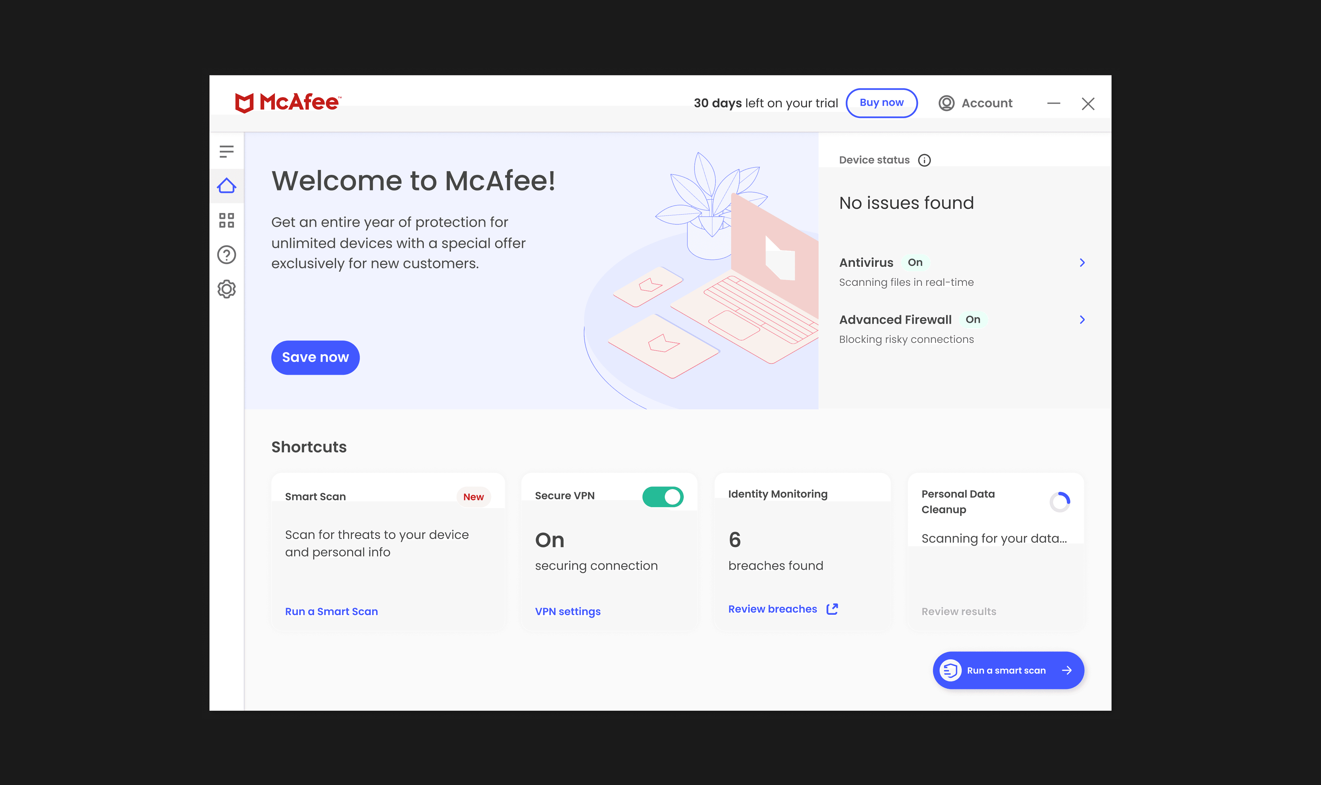
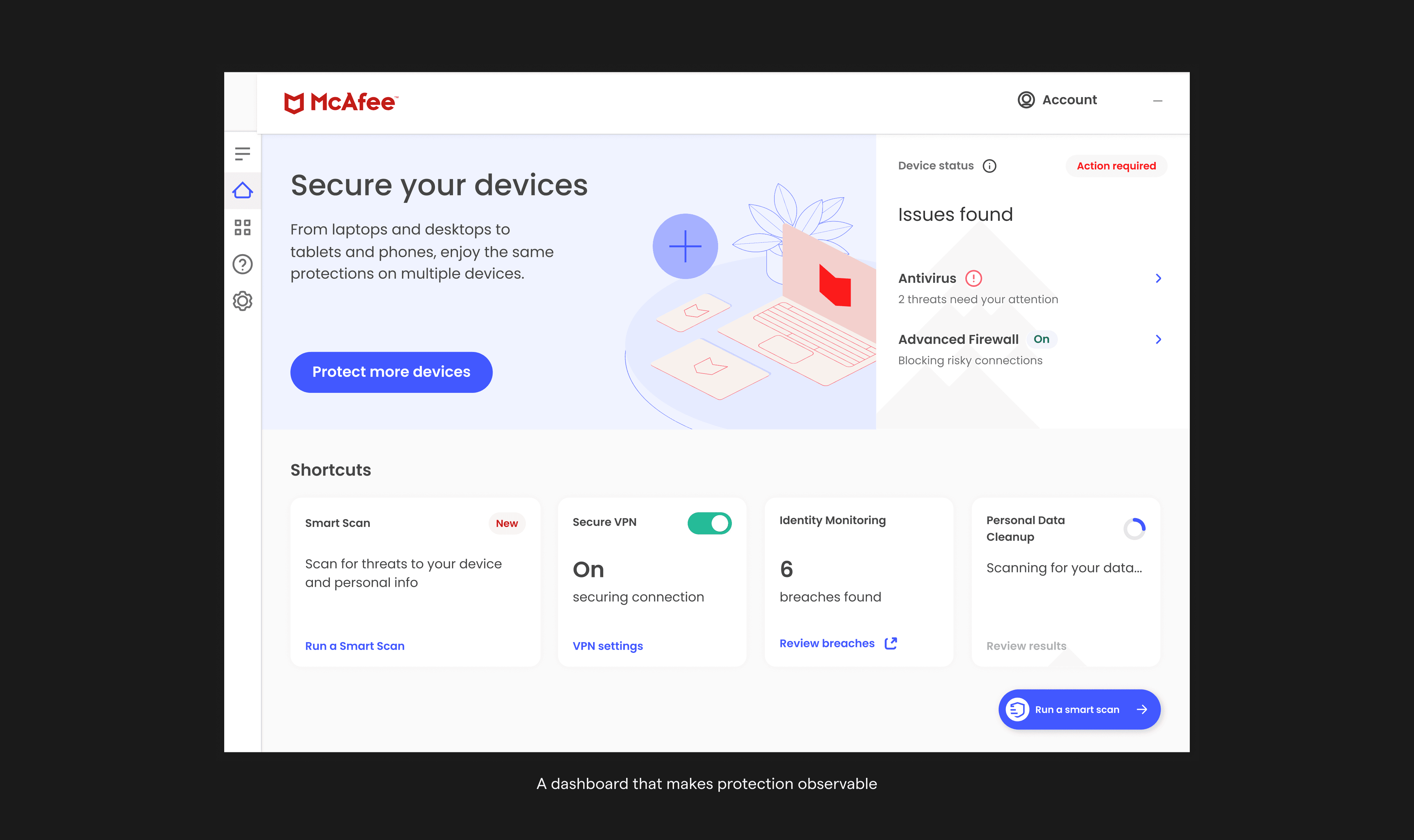
Making protection observable: the “value box”
To bridge business goals with user expectations, I introduced a new dashboard section that leadership coined the "Value Box."
The Value Box:
Surfaced immediate, meaningful value
Made protection status visible at a glance
Highlighted identity protection alongside antivirus—not instead of it
Suggested next steps based on where users were in their journey
This let the dashboard show users what they care about now (antivirus and device security), while also introducing what McAfee wanted to focus on in the future (being more than just antivirus.

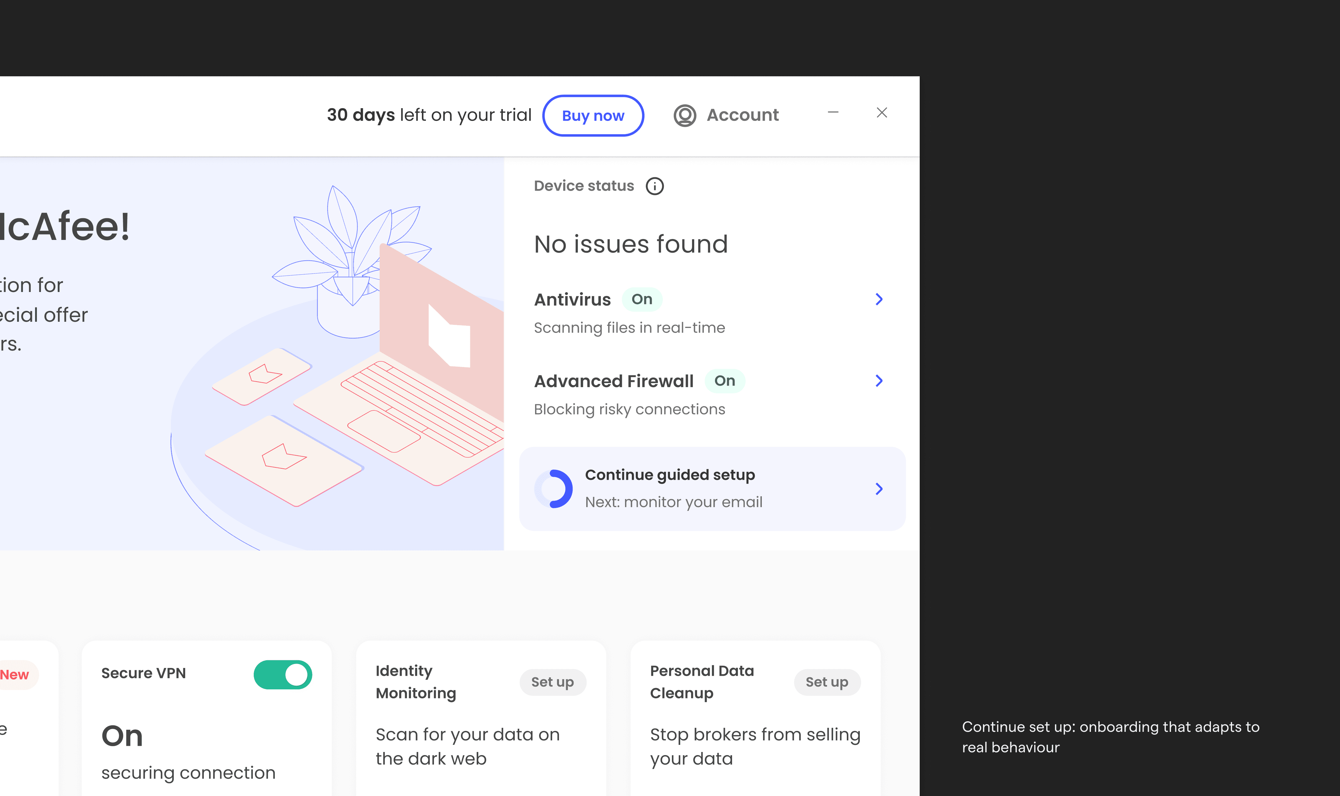
Continue setup: onboarding that adapts to real behaviour
Users don’t always complete onboarding in one session. To prevent them from getting lost when they come back, I introduced a continue setup widget.
This guided experience:
Reflected completed steps
Highlighted what remained
Adapted to each user’s current state
Focused attention on one meaningful next step
Users could now stop and come back at any time. The system remembered their progress and knew what to show them next.
Outcome / Impact
Business results
After we launched, the new experience showed clear results:
43% more people used the top three features
17% lift in registration/sign up rate
6.8% improvement in conversion
These improvements happened because we made things clear and earned people's trust. Not solely pushing them to buy first.
Organizational impact
The new onboarding experience was expanded to paid OEM desktop users, rolled out across 8 geographies, and adopted by the WebApp, establishing a unified onboarding model across platforms.

In conclusion
This project reinforced my belief that strong design leadership is about creating systems in which both user and business goals are interdependent.
By grounding decisions in research, designing for trust, and building scalable frameworks, I helped transform onboarding from an empty entry point into a value-led experience that worked for users, the business, and looked to the future of the product.